As Instructional Designers, it is ultimately our responsibility to make learning deliverables appealing, effective, and memorable. While high-quality content and instructional design are the foundation of any effective learning deliverable, well-designed graphics and other visual designs help attract learners to your content. Quality graphics makes your content more understandable… more easily remembered.
While looking for resources to assist in making my learning deliverables more memorable and appealing, I stumbled across a FREE eBook called 61 Tips for Making Learning Memorable with Graphics and Visual Design on the e-Learning Guild website http://www.elearningguild.com/ . The e-book featured tips compiled by 12 learning professionals from the visual arts profession, many who have just mastered some of the basics. In the eBook, the experts share their tips for making learning memorable with graphics and visual design. Their tips address such topics as finding inspiration and nurturing creativity; the basics of good visual design and layout; the importance of keeping things simple, consistent, and on-brand; using graphics, text, fonts, and color effectively; supporting learning through intuitive interfaces; testing deliverables for quality; and ensuring instructional integrity.
Below I share my favorite top 12 tips from their list:
- When you review the work a graphic designer has mocked up for you and you see something you don’t like, resist the urge to immediately state your opinion. Instead, ask questions to understand why the designer made those design choices. This opens a dialogue with the graphic designer, and it’s likely you’ll learn about factors that went into that decision that you were not aware of. – Linda Mahnken
- Research to gain inspiration. Consider this famous quote by Picasso: “Good artists copy, great artists steal.” Every artist is influenced by others. Seeing what others have done, and their results, can be a great source of inspiration and can even help you avoid mistakes. These days technology can help make this a lot of fun; create a Pinterest board or Evernote notebook of ideas. For the time it takes, you’ll be greatly rewarded with a flood of new ideas. – John-Carlos Lozano & Steve Yacovelli
- Get inspired by others. No design is completely new. Graphic designers and other artists pull from hundreds of years of art history and innovation. If you find a design you love, identify elements of it you can use in new ways. – Cassandra Cloud
- Embrace white-space: Whitespace is the part of your slide that does not have any content; it is like the oxygen of the presentation. If you use it all up, your audience will suffocate. So leave a little breathing room. In fact, leave a little bit more than you think you need and let your presentation breathe easy. – Laura Wall Klieves & Ryan Orcutt
- Have fun—no matter how serious the subject, there is always a place for good design. It works like a frame. Often, the more serious the topic, the more valuable the design element. – Don Levy
- Use contrast. Ever looked at a slide, and not known what’s important? Contrast helps draw attention, create drama, and set hierarchy so your audience understands your message. – Laura Wall Klieves & Ryan Orcutt
- Avoid motion sickness! Animation is a great way to dynamically communicate ideas and guide a viewer through ideas. However, it can be an overused technique. This includes transitions, especially the fancy ones. – Don Levy
- Look for ways to be lazy! Identify elements across your project with the same characteristics, set up styles for those elements, and then re-use those styles over and over. – Linda Mahnken
- Be consistent. Graphics and visual design are supposed to add clarity, but the opposite happens when randomness replaces a consistent flow of ideas. Unless you are teaching the art of confusion, visuals and graphics work best when they make their points in the context of a design flow. – Don Levy
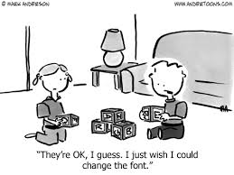
- Yes, there are lots of great fonts out there. It doesn’t mean that all of them need to be in your presentation. – Laura Wall Klieves & Ryan Orcutt
- Color is a powerful connector. It organizes information; it increases memory. We have physiological, psychological, and emotional responses to color. – Sarah K. Arkins
- Select fonts for readability. When text is harder to read, it is not only frustrating, but learners perceive the content itself as being more difficult. So use simple screen fonts at minimum 10-point size (12 or higher is better) and reserve more decorative fonts for large headings. – Dorian Peters
Until next week, happy learning…………………
Kellye


